Data can be exhilarating. Earlier this week, Avi Krawitz, Rapaport’s News Editor and Senior Analyst, called this reporter over to look at his screen, as there was something exciting on it. The attraction was a line chart of the RapNet Diamond Index (RAPI™) for 1-carat diamonds throughout 2018, showing that the peak price on July 6 coincided exactly with the day the US implemented its first China-specific tariffs. The index dropped through the end of the year.
He later beckoned a few more colleagues over, and there was soon a modest clamor of interest around his workstation. By the end of the day, even the office administrator was asking, “Did you see that graph?”
Charts can, it appears, tell a story in ways that would require many words. So we’ve decided to relive 2018 through five pieces of visual data about the diamond and jewelry trade.
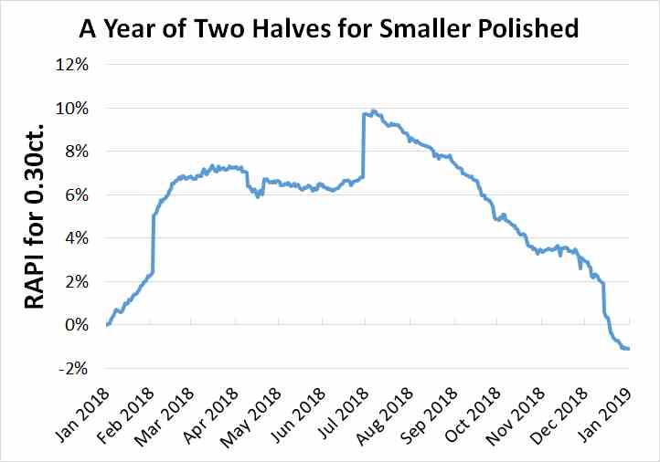
1. Small-stone prices slumped in the second half.
The RAPI for 0.30-carat polished fell from an early-July high point due to an oversupply, as well as macroeconomic factors such as the US-China trade war, with the category usually popular in China. While there was a similar trend in Avi’s 1-carat graph, the 0.30-carat category shows it more clearly. This index jumped 9.9% between January 1 and July 6, but ended the year down 1.1%.
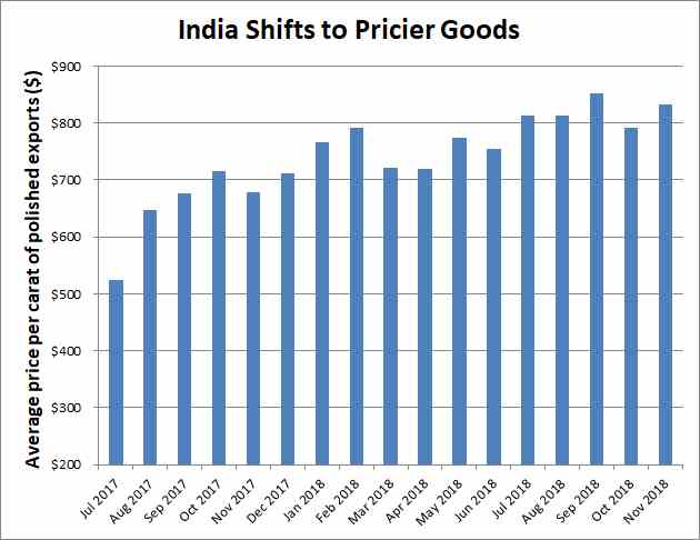
2. Traders embraced larger diamonds.
The industry focused on higher-value polished in response to the weakness in the smaller categories. That was visible in India’s export data, which showed growth in the average price of the nation’s outbound polished shipments up to November.
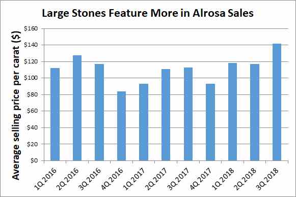
3. Rough demand followed suit.
Alrosa’s average rough-diamond selling price increased 19% to $123 per carat in the nine months to September amid a shift in demand away from smaller goods toward larger stones. It also noted a 5.2% increase in like-for-like prices during that period.